Back in April I planned to write a two part series about setting up my floral studio here in Washington. I have wanted a professional space of my own for many years and I personally enjoy behind the scenes glimpses, so I wanted to share this transformation with you. I am still putting the finishing, finishing touches on the space, so I am going to make “The Makings of a Floral Design Studio” into a three-part series, with one more still to come. All good things take time, right?
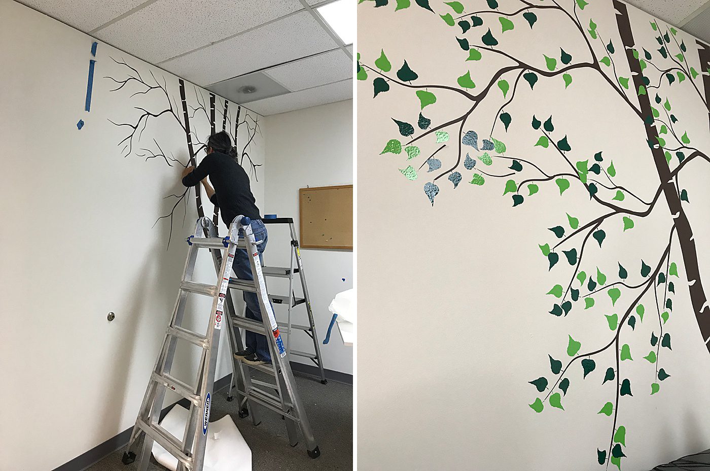
After getting the walls painted, all of the boxes of vases and supplies unpacked, and a handful of canvas prints hung up while my mom was in town earlier this year, I continued to focus on the aesthetic of the space, really, the feeling of the space. I always envisioned my studio to be colorful, cheerful, and welcoming. Since the studio doesn’t have any windows my mom had suggested putting up forest-themed wallpaper to give the illusion of being outside. There’s a number of studies saying that being in nature actually makes us happier and healthier. For simplicity reasons we decided on a floor to ceiling tree decal. Mom had gone back home by the time the decal had arrived, so my wonderful husband helped put it up. After we got the branches up I spent the next few hours sticking the leaves on…one at a time. I learned that decals require a lot of precision and patience! All good things take time, right? 😉
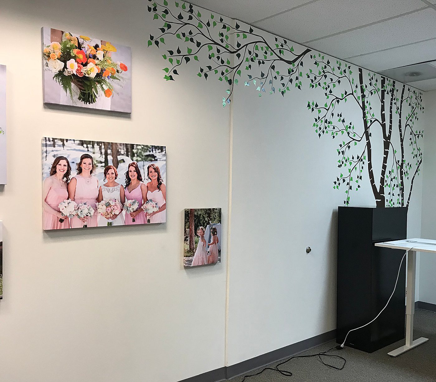
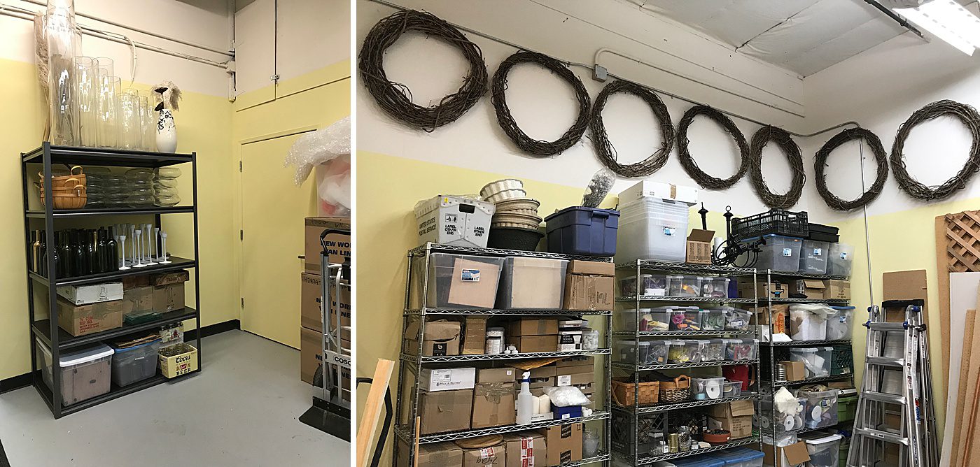
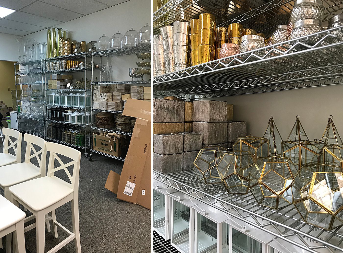
After finishing with the tree decal and adding a few framed pictures of flowers, I went about tackling the functionality of the studio. The first step involved getting organized. I spent the next week sorting supplies, cleaning vases, and arranging all of it.
The next step was to create a functional consultation space where I could meet with clients. Ever since I had first dreamed of my own studio space I envisioned a big table smack dab in the center of the room. My previous consultations had always involved taking over a coffee shop table. I would use the table as a platform for brainstorming and idea generation. It would be filled with inspiration images, a sketch pad, paint chips, and vases. The table was incredibly useful, a place where we could mix, match, play, and really get involved in the design of flowers. I just love when tactile elements can be used in collaboration. So, I needed a big table of my own.
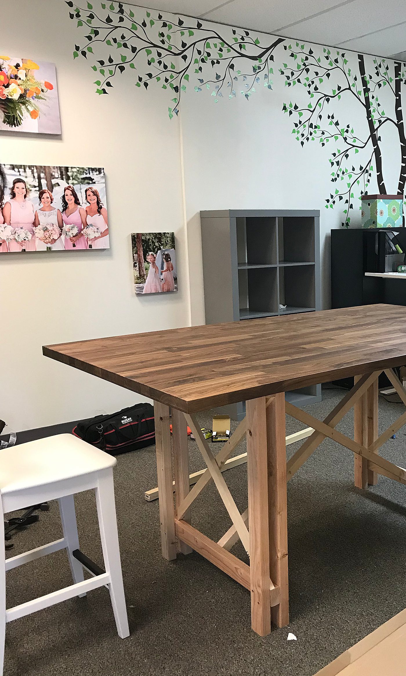
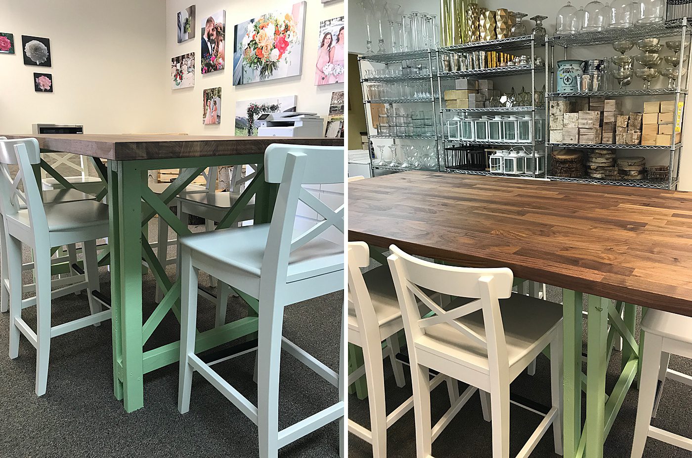
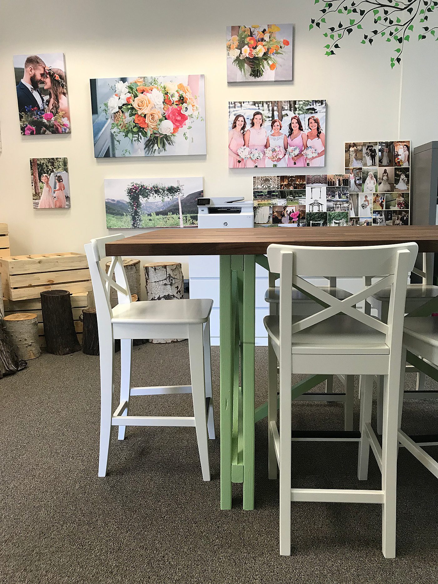
My first attempt at a table was a total bust. After assembling one I bought online, I realized I didn’t like the way it looked and the way it fit the studio space. After going back to the drawing board I decided on a counter-height table, which feels more appropriate for a creative space. I love the look of butcher block and found the perfect counter-top at IKEA. My husband (did I mention that he is wonderful?) then built legs for the table.

We placed the butcher block counter-top on the legs to see if it would hold and how it would look, and I immediately knew it was the perfect table for meeting with clients. Handcrafted, wide, and sturdy. Just right!
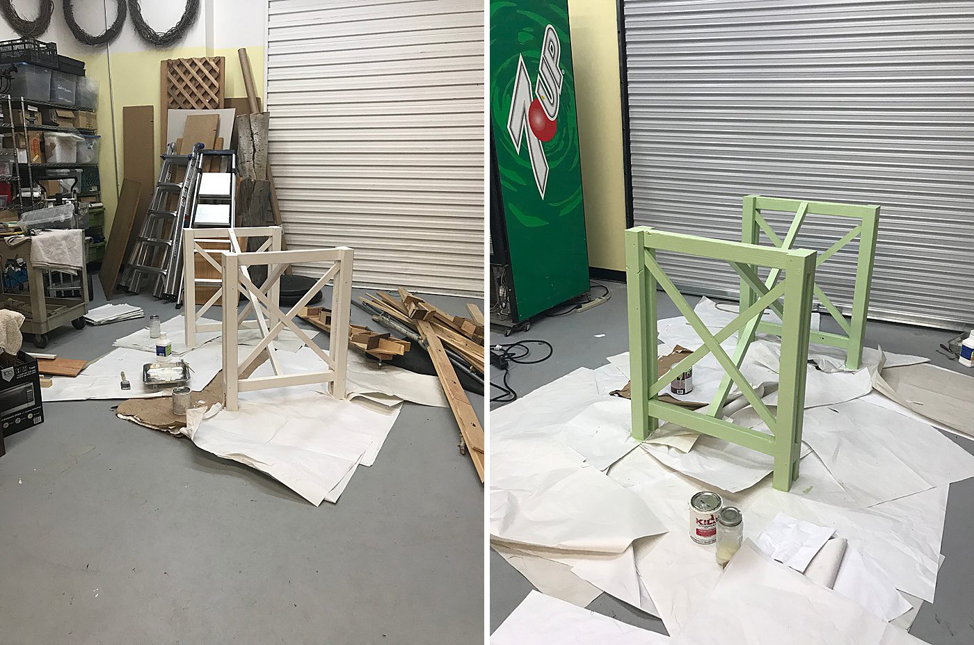
To give the table a more finished look, I decided to paint the legs. First I primed and then painted the legs a soft green color, similar to the green of my logo. I am generally drawn to cohesion and to see the evolution of the studio is joyful!
Stay tuned for the third part of this blog series! I hope to have a video clip of the space so you can see how it is laid out and how the space flows. Better yet, I invite you to stop by and see the studio in person. I would love to invite you over and make you a cup of coffee or tea. We can spend some time collaborating on gorgeous floral designs! After-all good things take time, right? 😉
