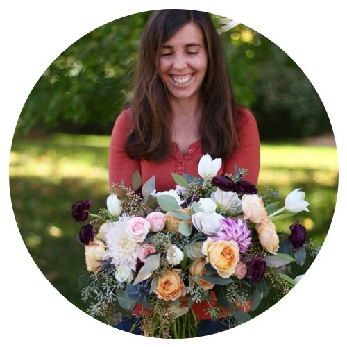
One of the very first questions I ask during my wedding floral consultation process is about color palette. I have couples to tell me about their overall wedding color palette and then use that to narrow in on the best combination for their floral color palette. Sometimes, however, my clients do not have a defined wedding color palette or their wedding colors are a little bit broader. And that’s totally okay! There are specific components of your wedding that you can look to for guidance when navigating the world of color and deciding on the best palette for your wedding flowers.
First, though, let’s take a look at the basic principles of color theory. These principles are the guidelines often applied when choosing color palettes that ultimately are balanced and aesthetically appealing. Understanding color theory is crucial for great design. The color wheel, which was invented in 1706 by Sir Issac Newton, can be used as a compass for choosing colors that work well together.
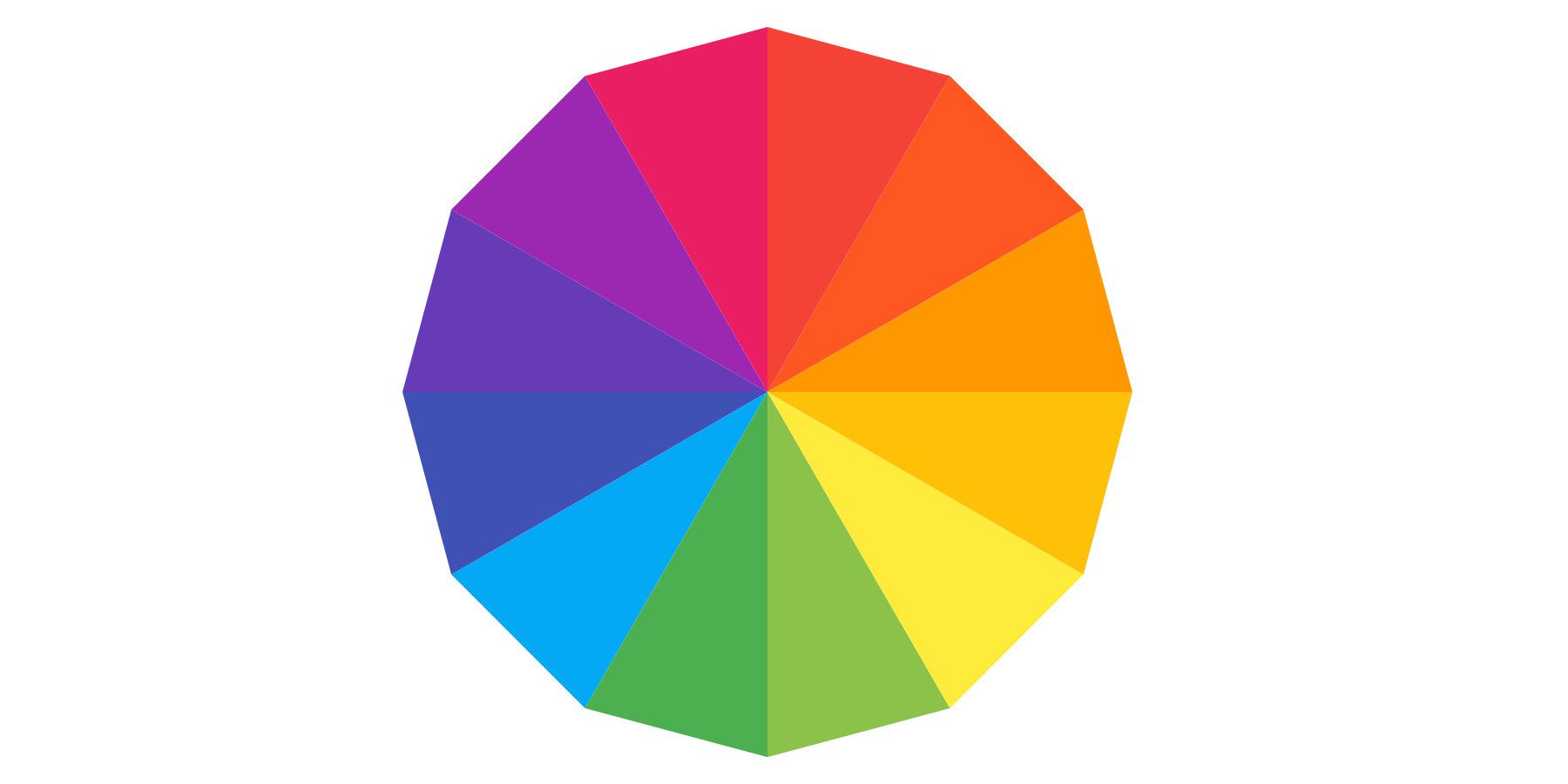
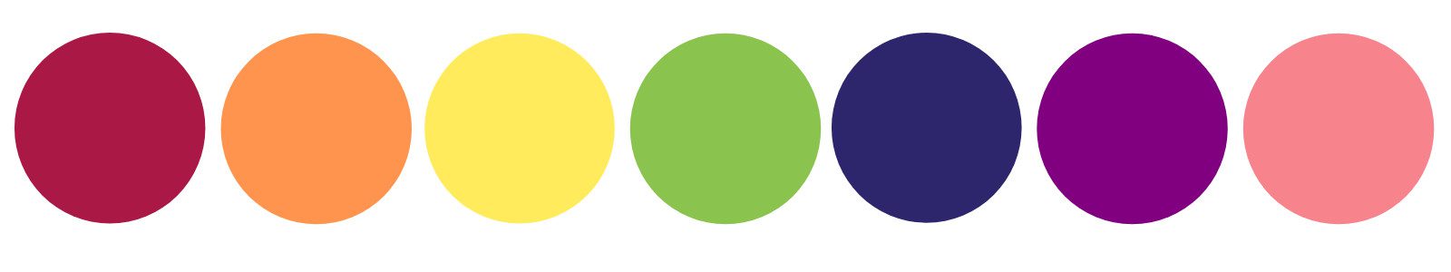
Three of the most fundamental color combination categories are: monochromatic, analogous, and complimentary. Here’s what each of them refers to and why each category works well in design:
Monochromatic
Monochromatic colors are variations of one color (hue) with different tints, tones, and shades. A monochromatic color palette is simple, yet sophisticated. Monochrome creates harmony and is calming.

Analogous
Analogous colors live next to each other on the color wheel. Color combinations using hues with close proximity on the color wheel can create a sophisticated and pleasing harmony. Analogous colors are guaranteed to work great together.
Complimentary
Complimentary colors that are opposite from each other on the color wheel creating strong contrast. Complimentary colors are especially pleasing as play up each other’s intensity. Complimentary colors are often perceived as soothing as they stimulate different parts of the eye.

With this basic understanding of color theory, here are things to consider when deciding on a great color palette for your wedding flowers. This list is especially helpful if you don’t have a set wedding color palette, but can be useful even if you do!
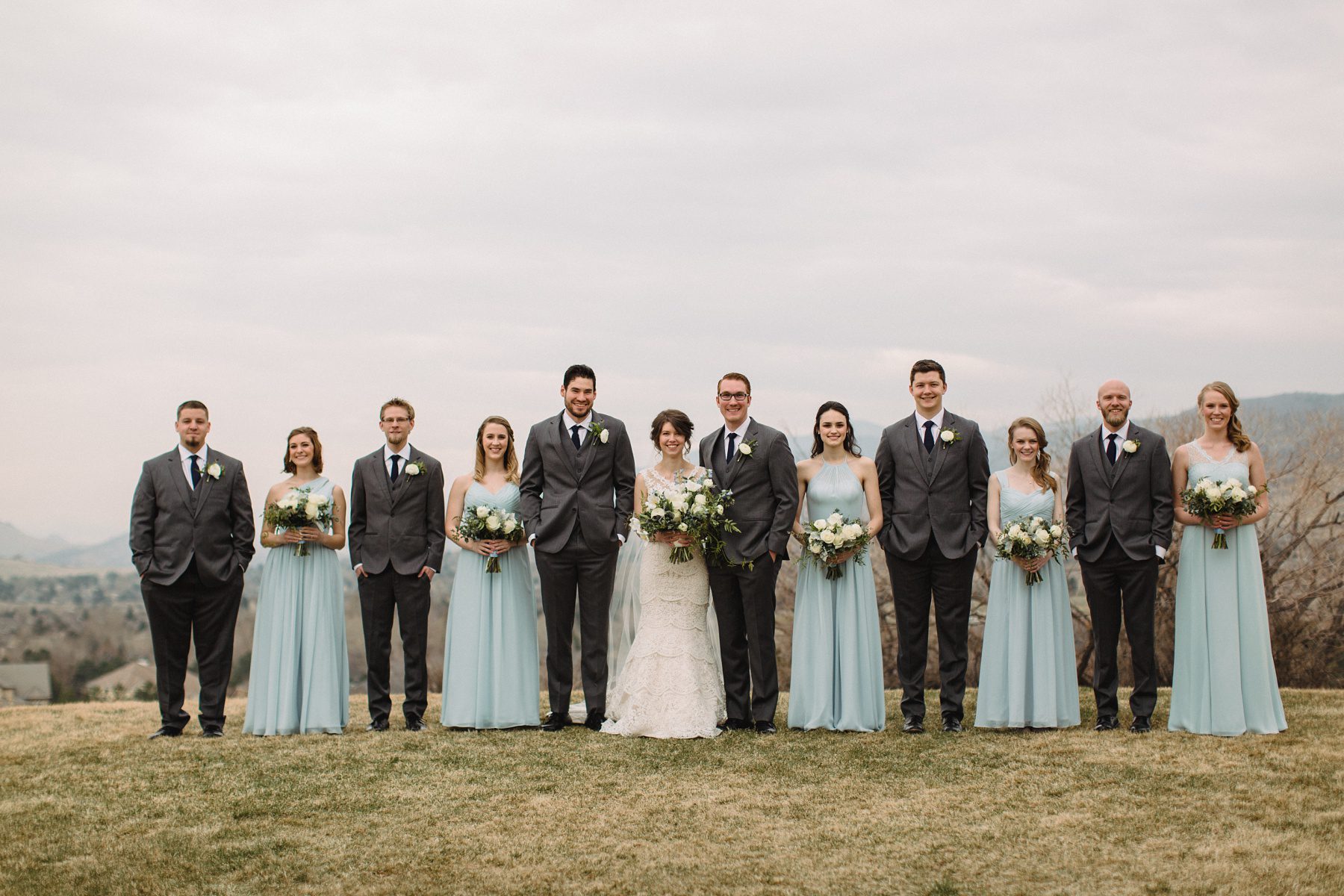
Picture courtesy of Pure Lee Photo
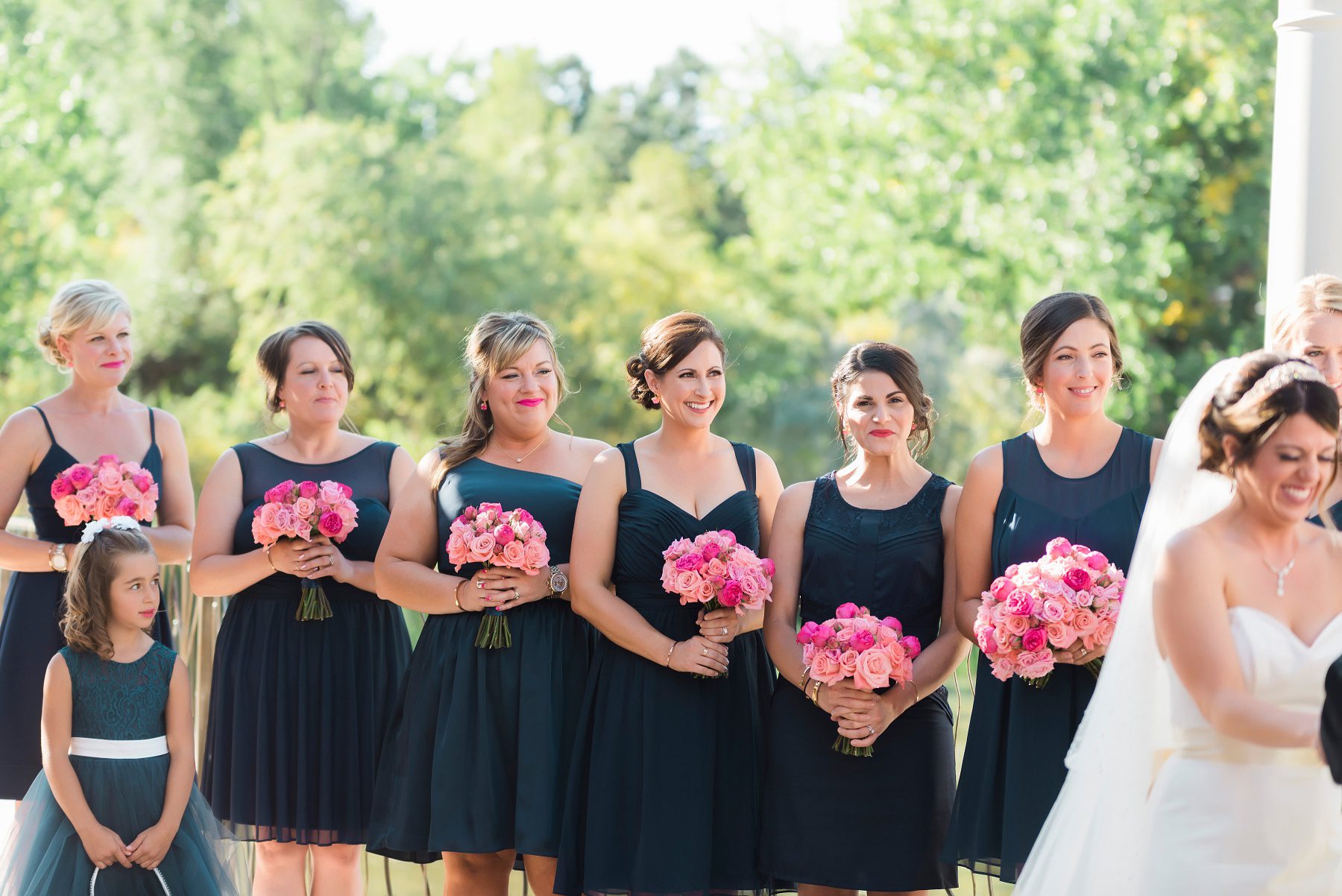
Color of Wedding Party Attire
Perhaps the biggest influence of your wedding floral color palette is the color of your wedding party attire, whether that includes just you and your significant other or if you have an abundance of bridesmaids and groomsmen. The wedding party is traditionally adorned with flowers, so making sure your personal floral pieces compliment your attire is key. Your wedding party is one of the main things that gets heavily photographed and we want those images to be beautiful, balanced, and colorfully cohesive!
I like to use a two-step process when helping couples choose colors that will work well with their wedding attire. When clients come to my Woodinville studio to review their floral proposals, I will pull out my stack of paint chips and will physically lay colors on top their wedding attire color(s). This allows them to get a feeling of all those colors together. I also ask my clients to send me pictures of their wedding attire so I can overlay a custom floral digital drawing. This has worked incredibly well in showing how a bouquet will look against a wedding gown or how a boutonniere will appear on a jacket. You can see some of my bouquet sketches for past clients on the ABOUT page.
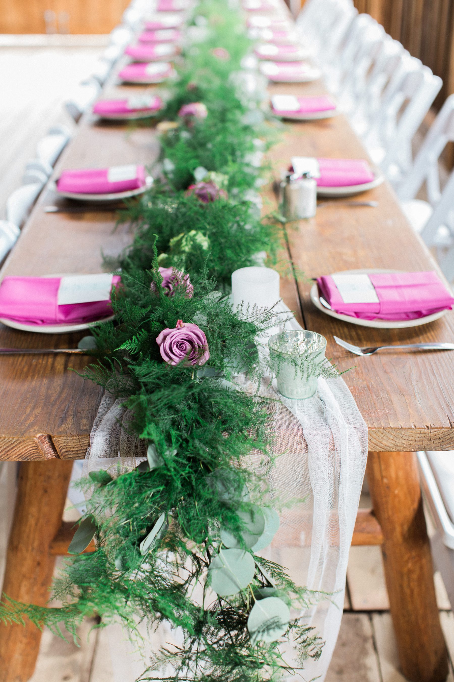
Picture courtesy of Sara Lynn Photography
Linen, Table Runner, & Napkin Colors
Another factor I often take into consideration when advising my clients on their wedding floral color palette, is the color of their table linens, table runners, and dinner napkins. The reception is the second most important part of your wedding and creating a space that is harmonious can positively affect the dining experience. If you are going with a colored napkin or a colorful table runner, including that color or a complimentary color in your table centerpieces can create more dimension and visual interest. Color that is placed intentionally in design is a way to engineer a particular experience. Don’t be afraid to use colors that will delight your guests’ eye receptors!
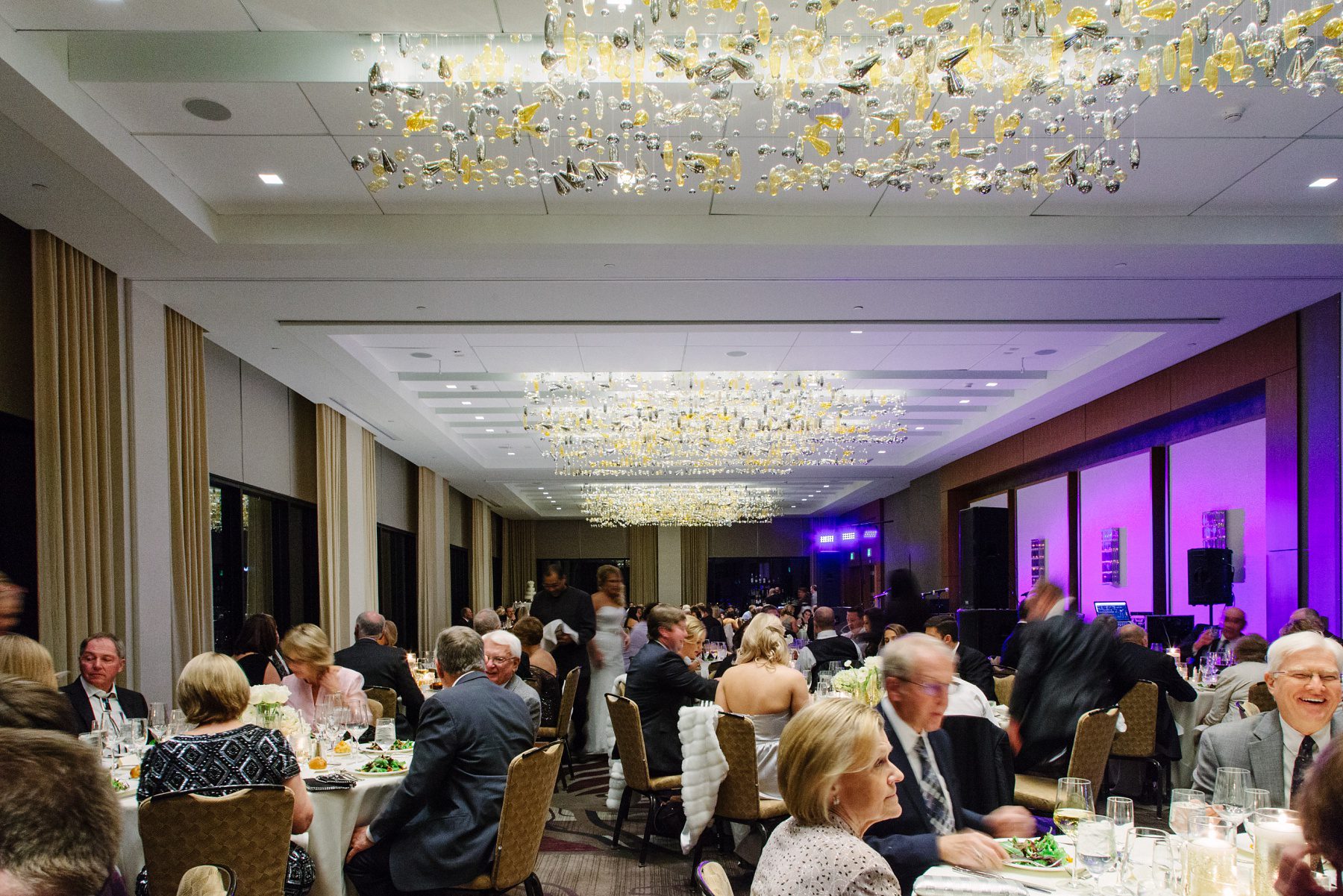
Picture courtesy of Newell Jones & Jones
Venue Colors & Aesthetic
It can be easy to overlook your wedding venue when deciding on your floral color palette. Wedding venues that are neutral in color are more adaptable to a variety of wedding colors. Some wedding venues, especially hotel ballrooms, can have distinct accents of certain colors, either colors in the carpet or colors in the ceiling fixtures. It always perplexes me when couples choose a reception venue that has colors that clash with their chosen wedding colors. It’s really, really hard to not notice the blue and orange patterned carpet when you’re sitting down for dinner. And while your soft pink floral centerpieces may be quite lovely on the white linen tables, they will look out of place next to that carpet.
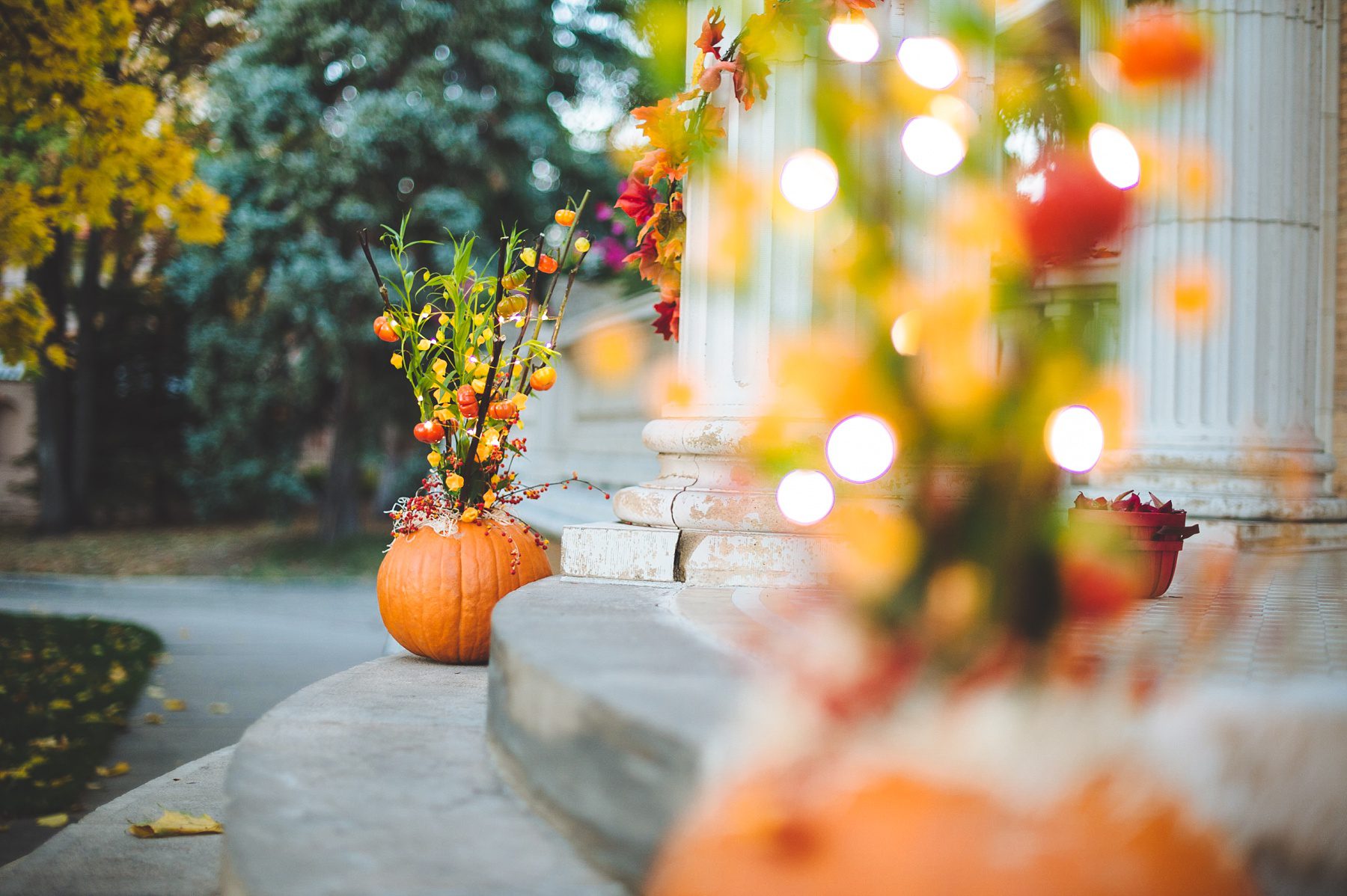
Picture courtesy of Teresa Woodhull Photography
Season
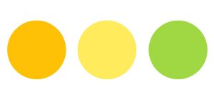
Sometimes Mother Nature can be a guiding hand in choosing a great color palette for your wedding flowers. If you are getting married in the fall, for example, it can be advantageous to use a fall color palette – reds, oranges, and yellows. The changing season can often lend itself to certain colors that become abundant in nature that time of year. You have an already established harmonious color palette that just makes sense!
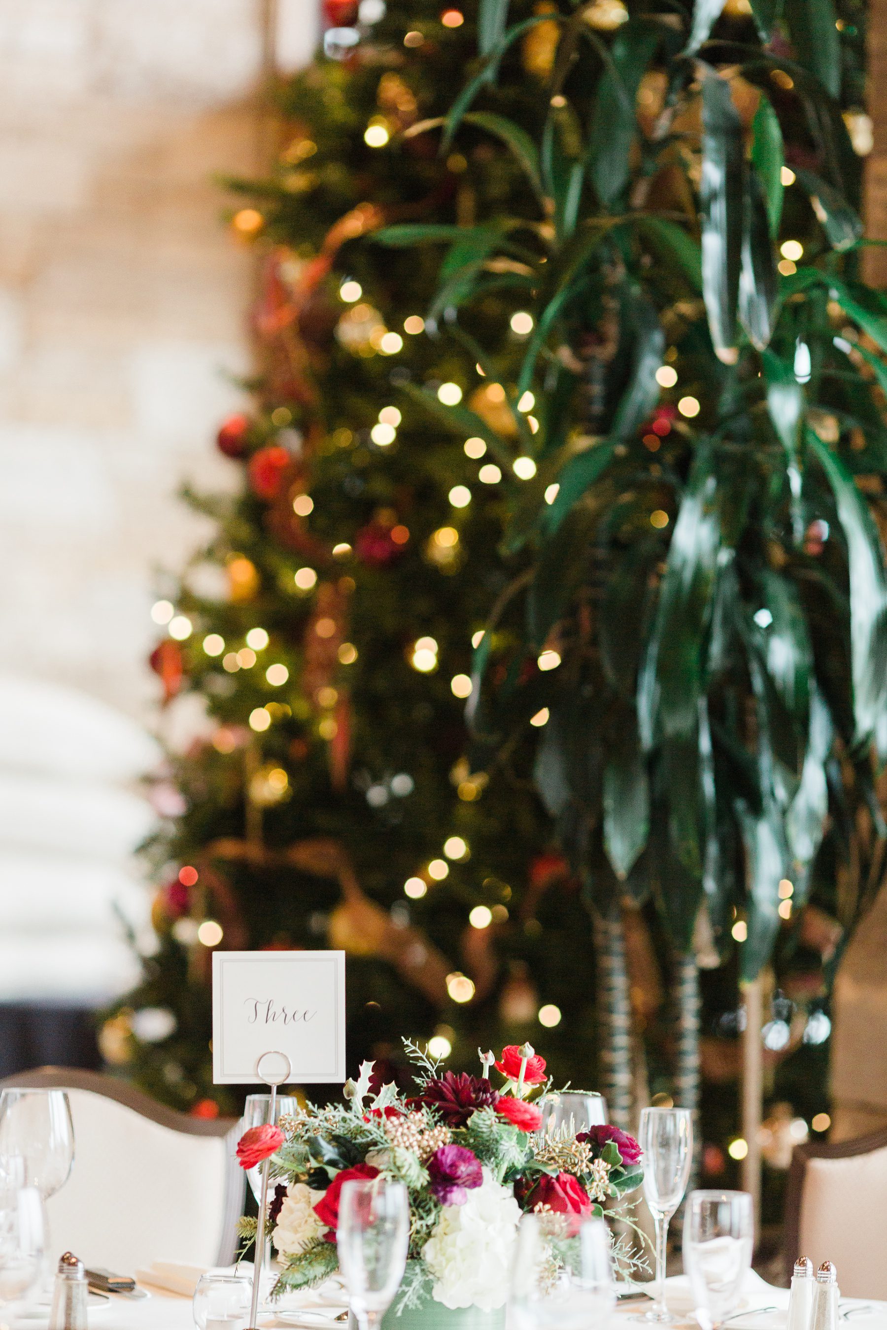
Picture courtesy of Chris Loring Photography
Theme
Some of my favorite weddings to be a part of are themed weddings. True themes go beyond the standard wedding style terms of chic, rustic, vintage, modern, boho, etc. Themes are overarching concepts that allow for aesthetic definition, structure, and specific meanings. Many of the annual Holidays can work well as a wedding theme.
Themed events are even more popular in the corporate world. Check out some fun themed arrangements on my CORPORATE page!
Picture courtesy of Talia Kite Photography
Personal Color or Flower Preferences
Sometimes I work with couples that just love a particular flower. While many flowers come in a multitude of colors, some flowers only grow naturally in one or two colors. You can use that flower color as a starting point for your wedding floral color palette. Other times I suggest that my couples use their favorite color to help define their wedding floral color palette. If you especially love pink and we create arrangements that are bursting with vibrant shades of pink, that will have a conscious (and subconscious) positive effect on you.
Floral arrangements are incredibly visual and because of that wedding flowers often can be a significant part of wedding decor. It’s no wonder that nailing your flower color palette is quite important and, rightfully so, commands a lot of thought, attention, and consideration. After-all an occasion that’s as special as a wedding should look and feel as significant as it is.
Do you need help solidifying a fantastic and cohesive floral color palette? Set up a CONSULTATION with me and let’s find your perfect palette!